Redesign of SecretFlying: Travel Budget Website
Aiding travellers in discovering deals without having to wander the web
Overview
For a graduate course, Information Architecture (IA), my team and I redesigned a travel budget website called SecretFlying. SecretFlying curates flight and hotel deals from a variety of external websites such as Skyscanner, Expedia, Priceline, etc. We specifically focused on the domain of travel and tourism as it was the hot topic of returning to “normal” after COVID-19 pandemic restrictions. Moreover, keeping in mind to design for optimal usability for travellers and considering the extensive amount of information that would be presented, we decided to keep the platform of SecretFlying as a website rather than converting it into a different platform (e.g. mobile, tablet, etc).
Problem
The initial impressions of SecretFlying jeopardized its legitimacy as a travel deal website. The unclear, inconsistent and unfamiliar content structure not only influenced users to perceive it as a fake website but also caused them to have difficulty finding deals. We chose to target this problem because by improving its IA issues, SecretFlying could be a convenient and trustable resource for travellers to find travel deals without breaking the bank.
Solution
Our website redesign of SecretFlying improved the navigation, organization, labelling and searching systems to promote understanding and findability of travel-related information. Moreover, we removed any ambiguity and redundancy of content that impeded users from identifying the purpose of the website or effectively using the website intuitively.
My Role
• Helped with content analysis
• Conducted a user interview
• Analyzed research to obtain insights
• Created a journey map
• Conducted two closed card sorting studies
• Constructed before and after IA schematic diagrams
• Executed two tree testing studies
• Designed and prototyped the mid & high-fidelity prototypes
• Conducted a user interview
• Analyzed research to obtain insights
• Created a journey map
• Conducted two closed card sorting studies
• Constructed before and after IA schematic diagrams
• Executed two tree testing studies
• Designed and prototyped the mid & high-fidelity prototypes
Team of UX Design Students
Robyn Jane Carino
Zhuoran (Doria) Fu
Teresa Lau
Astrid Manzanilla
Dakshata Shukla
Tools Used
Figma, Miro, Optimal Workshop, Balsamiq, Google Workspace, Zoom
Process
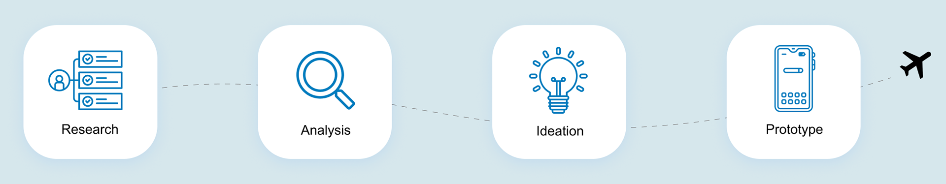
Research
We utilized various evaluative research methods, specifically formative evaluations, to understand which aspects of SecretFlying’s design needed improvement. Conducting five different methodologies, such as competitive analysis, user interview, usability testing, card sorting and tree testing, helped identify specific information architecture issues to focus on for our project.
Competitive Analysis
Foremost, we studied several travel websites to understand the strengths and weaknesses of their navigation, organization, labelling and searching systems in addition to their offered exclusive features. The analysis provided us with the limitations of these sites so we can turn them into opportunities for SecretFlying.

After completing the competitive analysis, we moved forward with user research, specifically a user interview and usability testings.
Target Users
Why did we choose them?
Students
Undergraduate and postgraduate students from various Canadian universities who planned to travel or had recently travelled
Limited with finances
Since students lack (steady) income and have school-related expenses (e.g. tuition, ancillary fees, etc) in addition to other expenses, they are more inclined to save money elsewhere, such as travel
Family Members
Families who regularly planned vacations by finding deals to save money on travel costs
Requires saving strategies
Family vacations consume a portion of household income(s) and have travel costs per family member along with necessary accommodation costs
Budget Enthusiasts
On the constant lookout for travel deals to plan trips well within their set budget
Inflexible with budget
Consciously seeks travel deals within specific financial parameters with little to no flexibility in budget
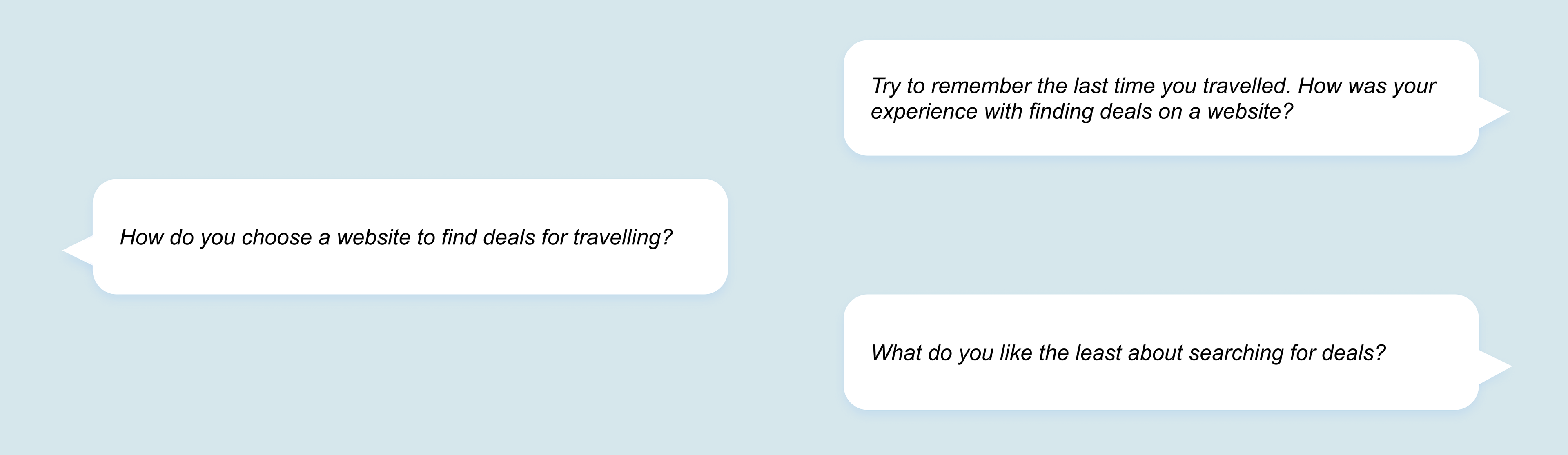
User Interview
I conducted a user interview with a student to understand their process of finding travel deals (not specific to SecretFlying). The semi-structured interview helped bridge the gap between the offerings of the travel market with the actual wants and needs of the traveller.
Some Interview Questions
Main Insights and Findings
Found deals on websites, blogs, social media and reward point cards
Mostly found deals on websites and blogs. Occasionally found discount codes on social media. Interestingly, the student discovered discounts and promo cards through reward point cards.
Motivated when it is easy to find deals and can learn about their trip
Had an easier time finding deals when promo codes were advertised on the front page of websites, and they liked learning about details of their trip while searching for deals.
Frustrated with manually finding deals which requires time and effort
The websites used by the student (one of them being HeadOut) did not help cater deals for them; thus they manually searched and compared prices despite spending a lot of effort and time.
Suggested adding filters and displaying deals overtly
The student desired filters to find the best deal instead of manually finding deals. Moreover, they wished websites would display discounts, deals and promotions straightforwardly.
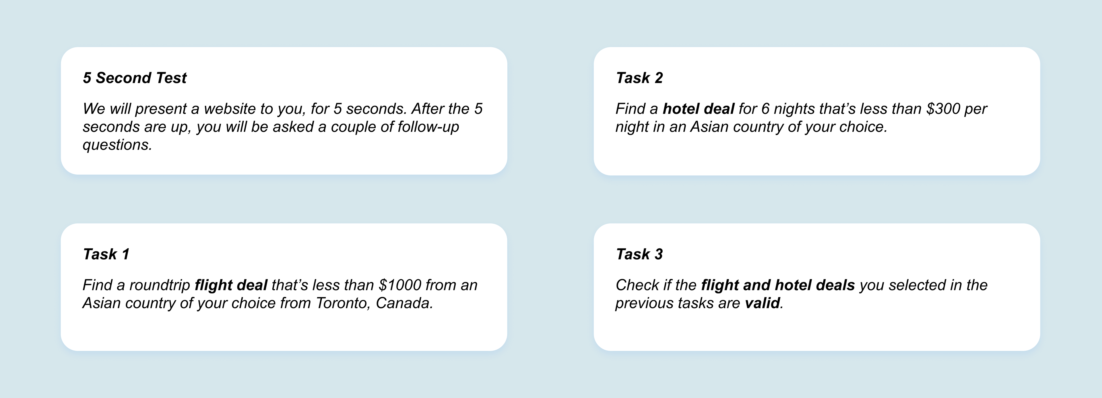
Usability Testings
Next, two members of my team each conducted a usability testing respectively with a family member and budget enthusiast to understand which aspects of the current website worked well and not. The results helped verify any weaknesses detected from the competitive analysis and user interview. Moreover, the usability testings identified new pain points, specifically with the searching system, that were not indicated by the previous research methods.
Tasks Given
Main Insights and Findings
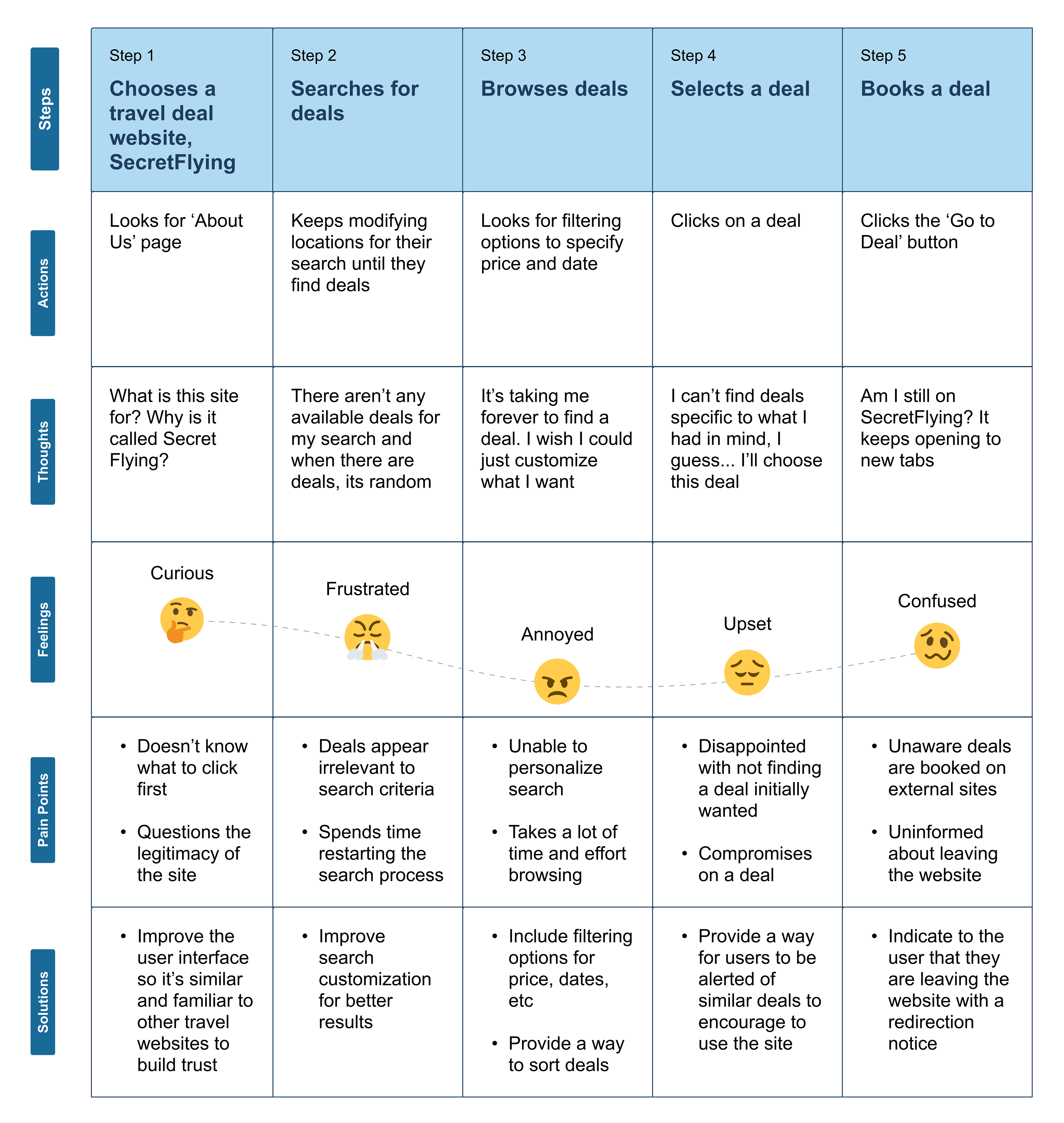
Confused with the website's purpose and questions the legitimacy of the website
At the initial encounter, they felt disorientated due to being uncertain of the website's purpose. The presence of expired deals as well as the overuse of white space and advertisements arose doubts for both participants regarding the website’s legitimacy - despite multiple testimonials.
Struggled with finding deals from a specific city or airport and in general
Both participants had issues searching for deals because of inaccurate search results for specific locations (e.g. when the budget enthusiast searched for flight deals to Japan, random locations unrelated to Japan appeared).
Frustrated with finding irrelevant deals according to their search
Both participants were frustrated with broad results that did not match their search preferences. Moreover, participants were annoyed and overwhelmed browsing deals as the search results disregarded whether the user wanted to travel from or to their chosen location.
Suggested adding filters, a search bar for hotel deals and an in-platform booking system
Both participants suggested adding filters for pricing and date. The family member expressed adding a search bar for hotel deals as it was inconsistent with flight deals which had its own specific search bar. The budget enthusiast emphasized adding a more coherent and in-platform booking system to foster user trust.
Analysis
Journey Map
I created a journey map with the current experience of SecretFlying using our research insights. This helped indicate and define pain points to generate possible solutions.
Ideation
Card Sorting Study
We conducted 9 card sorting studies on Optimal Workshop to see patterns of agreement and disagreement in organizing information. Initially, we did 5 closed card sorting studies (2 of which I conducted) to prevent participants from feeling overwhelmed and lost on what categories and cards to make.
However, we received the opposite feedback. Many wanted more freedom and preferred the hybrid model so they could share opinions, mostly their confusion, on how the website should be organized. Thus, in round two of card sorting, we did 4 hybrid card sorting studies.
Main Insights and Findings
Some categories and labels were unclear and ambiguous
Participants misunderstood or asked clarification for the category ‘Alerts’, as well as the cards ‘Error Fares’, ‘Media Kit’ and ‘Travel Glossary’ meant
The categories that took the most time to sort were the most agreed upon participants
Participants collectively took the most time putting cards into the ‘Deals’ and ‘Travel Tips’ categories. Despite this, both categories were the most agreed upon.
Some categories consistently confused participants with other categories since they shared similarities
Some categories such as ‘About Us’ versus ‘Contact Us’, ‘Travel Tips’ versus ‘Deals’, ‘FAQs’ versus ‘Alerts’ and ‘Media Kit’ versus ‘Testimonials’ consistently confused participants
Some categories were broken down into more categories
A participant believed that ‘Hotel Ratings,’ ‘Pricing,’ and ‘Error Fares’ were deemed more effective as filters rather than stand-alone pages.
The results of these studies and the discourse between the group helped immensely how to improve all four IA systems, specifically the organization system of SecretFlying, which was previously inconclusive based on the competitive analysis. Here is the finalized version of the card sorting used to carry forward our project.
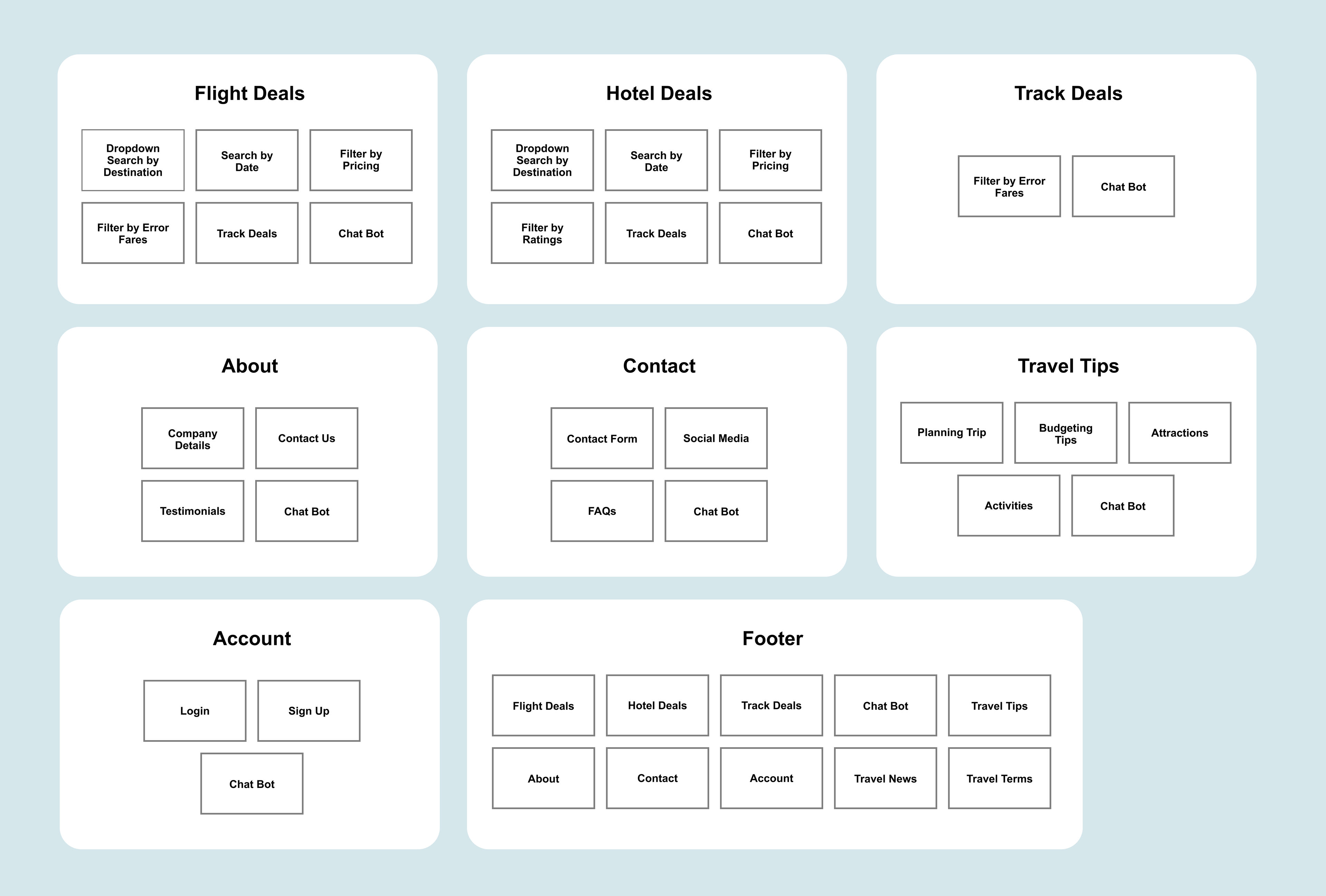
IA Schematic Diagrams
I created a ‘before’ IA schematic diagram to inspect the structure of the content in terms of the navigation, organization, labelling and search systems of the website.
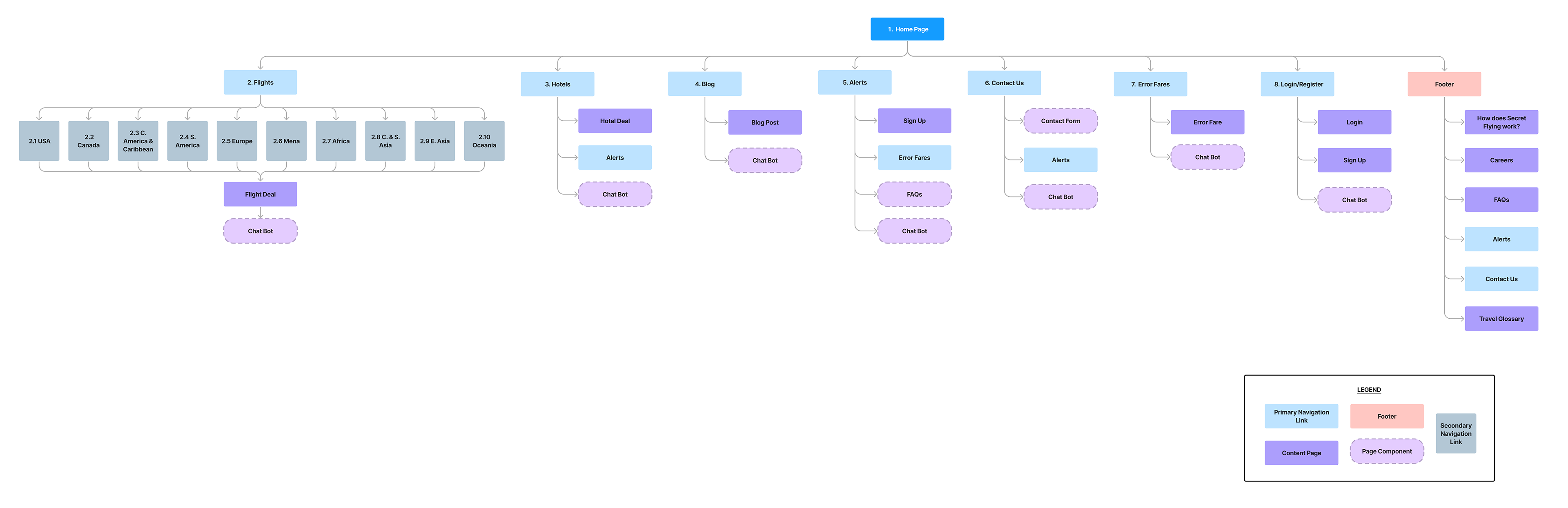
I also constructed an ‘after’ IA schematic diagram to indicate changes to the IA based on data collected thus far from the competitive analysis, user interview, usability testings and card sorting studies
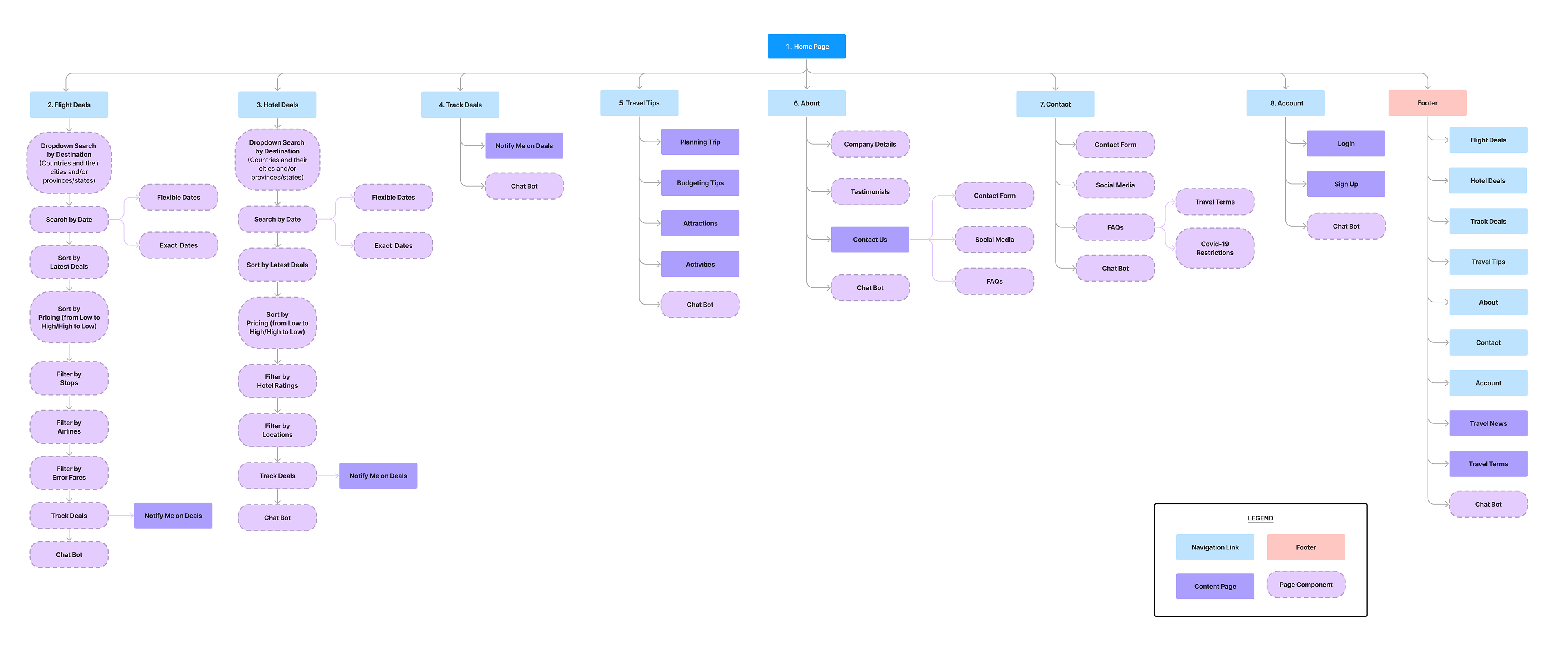
Quick Recap of Changes in IA
Navigation System
• The seven navigation links in the global navigation system changed to “Flight Deals”, “Hotel Deals”, Track Deals”, “Travel Tips”, “About”, “Contact”, and “Account”
• In order to increase the consistency of the navigation systems between all types of deals, we removed the inconsistent local navigation system in the flight deals page to help the user gain familiarity with the website.
• Divided the “Blog” into “Travel Tips” as a navigation link and “Travel News” as content in the footer
Searching System
• A dropdown search displays destinations by countries and their cities and/or provinces/states
• Provided a filtering system containing pricing, ratings and error fares to accommodate the variety of features among users; ensures that every user can customize their search, without needing to sift through unrelated deals.
• Provided a sorting system for dates of deals to aid the user in their travels
Labelling System
• Since ‘error fares’ is used within the travel industry, we kept the term and provided a pop-up explanation so users know what the term means
• Renamed ‘Alerts’ to ‘Track Deals’ and Travel Glossary’ to ‘Travel Terms’ in order to allow users to focus on finding travel deals and planning their trips instead of trying to figure out what certain words mean
Organization System
Able to customize finding deals by the dropdown search, sorting and filtering systems; helps organize deals based on the user’s preference
Tree Testing Study
We executed 10 tree testing studies, 2 of which I did, on Optimal Workshop to understand how users found the information to see if we successfully improved the four IA systems: navigation, organization, labelling and searching. The study provided the direct and indirect success of users finding content.
Tasks Given
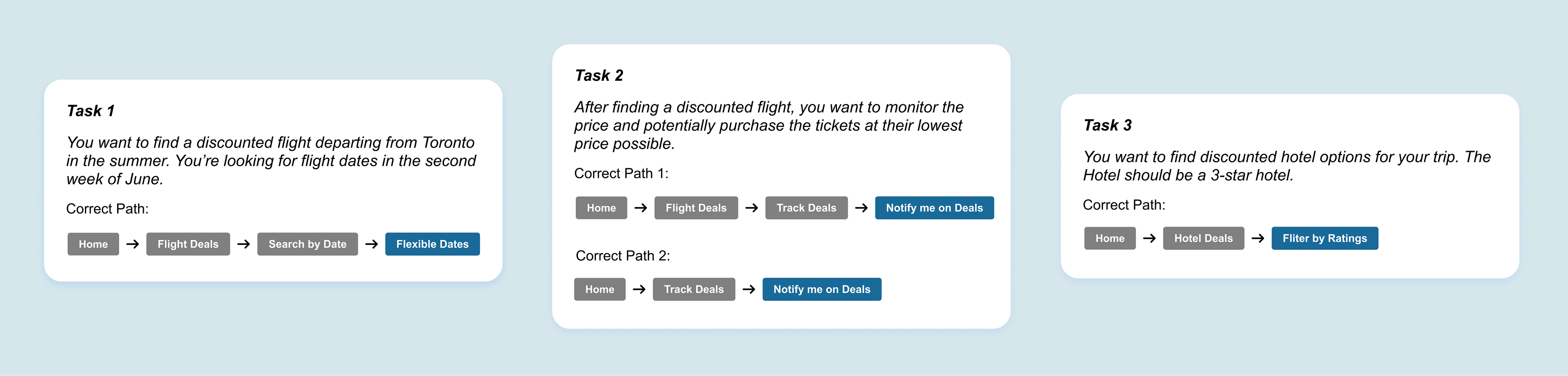
Main Insights and Findings
40% direct success finding a flight in the second week of June
4 of the 10 participants got the answer right and all 4 participants reached the right path directly. We did not receive any “indirect” path that was successful for this task.
60% total success and 40% direct success tracking prices for the selected flight
6 of the 10 participants got the answer right. 4 out of 6 participants were able to reach the correct option directly, whereas 2 participants reached the correct answer indirectly.
100% total success and 70% direct success finding a hotel filtered by ratings
All 10 participants got the answer right. 7 out of 10 participants reached the right path directly while the remaining 3 were able to reach the right answer indirectly.
Task 3 was the most successful while, task 1 was the least successful
The most successful of the tasks was Task 3: Finding a hotel deal, filtered by ratings. The least successful of all the three was Task 1: Finding a flight deal with flexible dates.
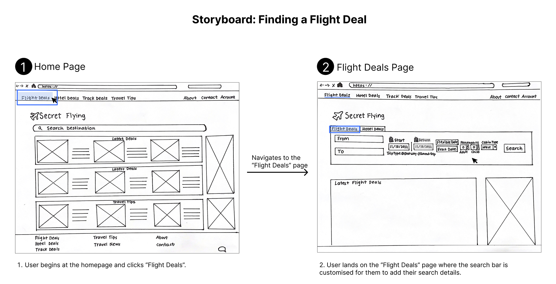
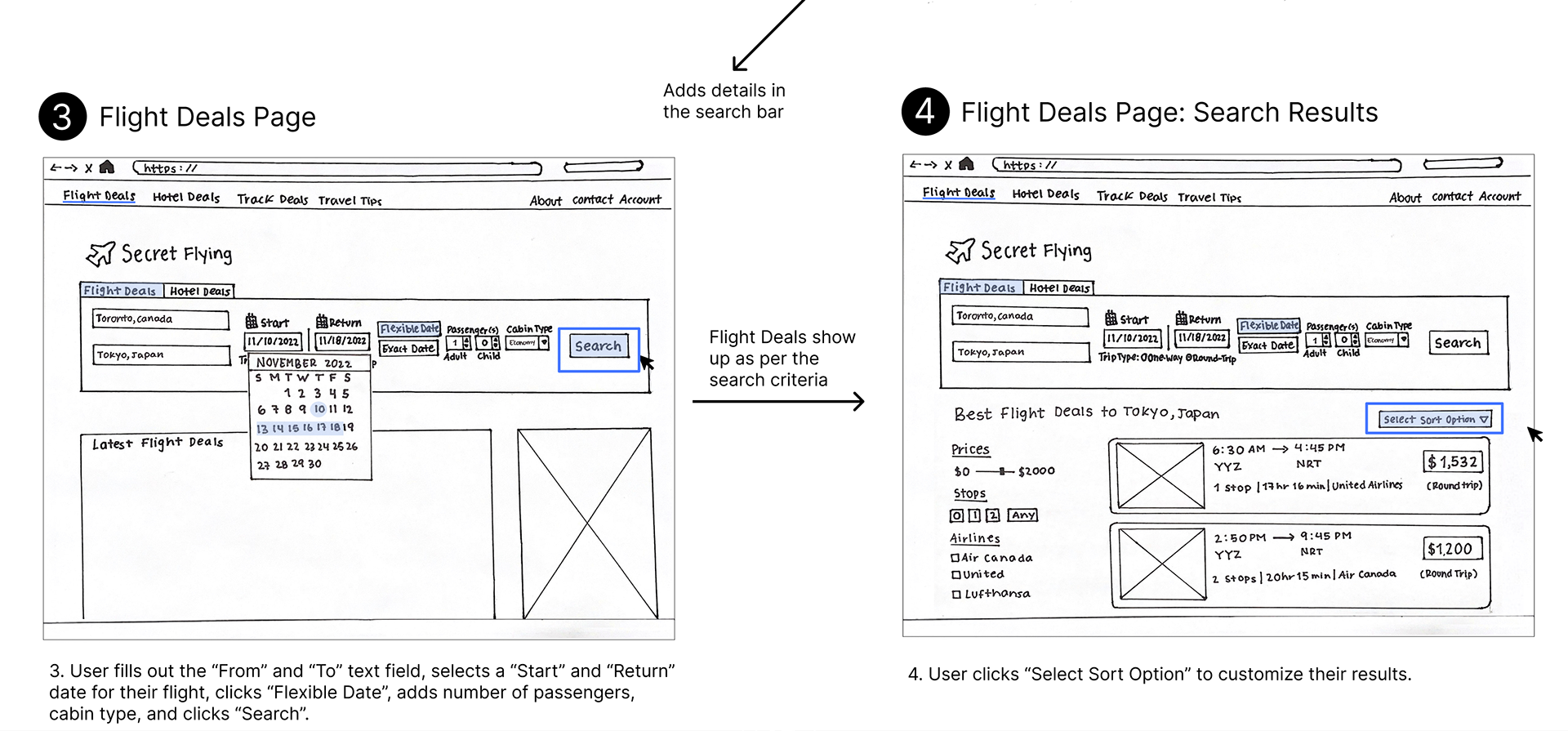
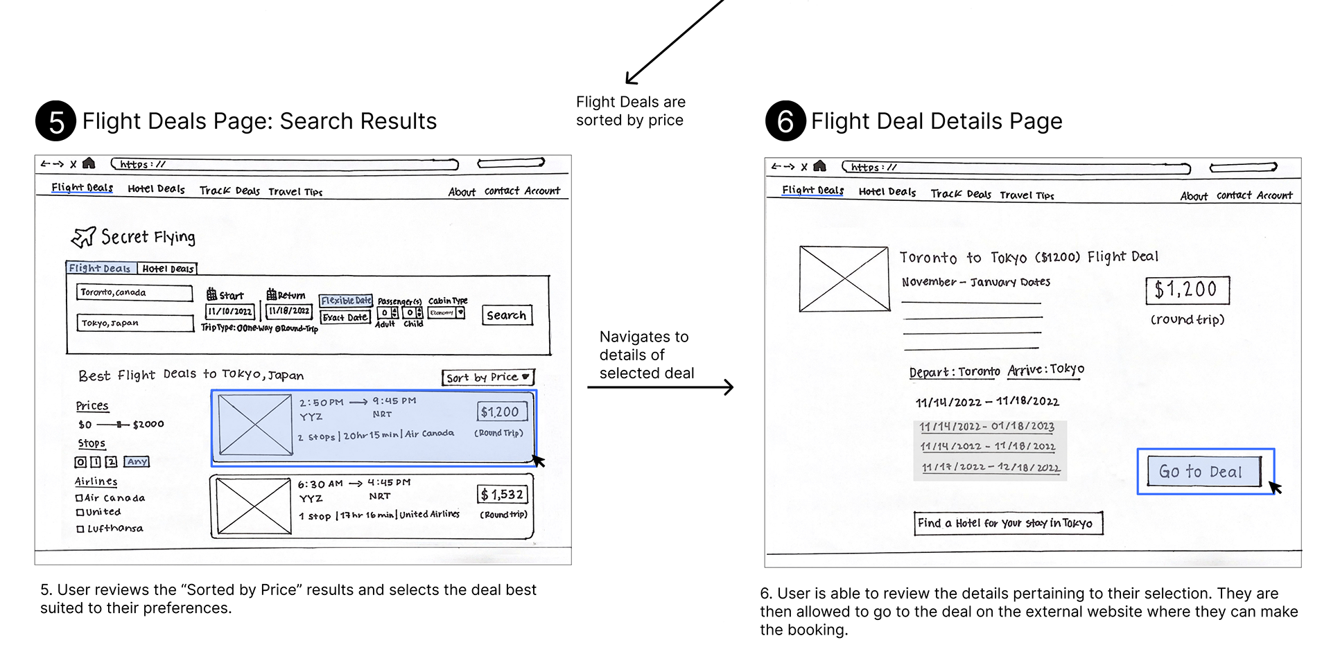
Prototype
Low-Fidelity Prototype & Storyboard
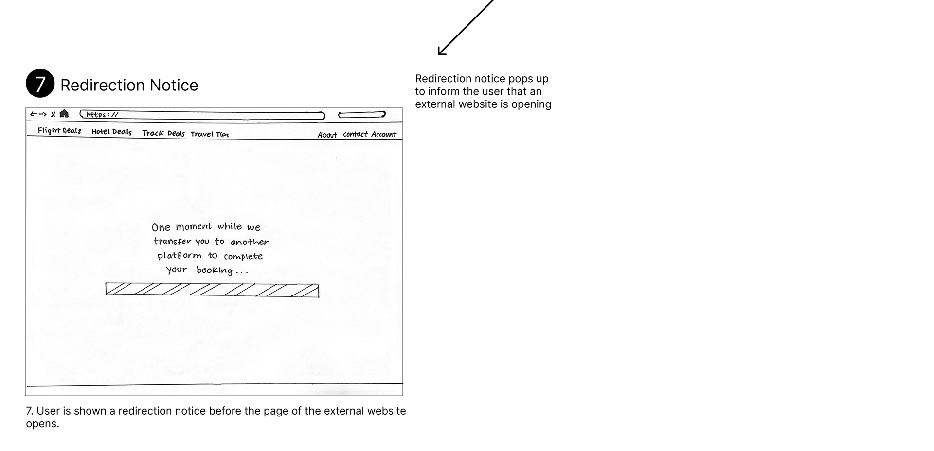
After we finalized the IA schematic diagram, we sketched design concepts in a low-fidelity prototype to display the improved version of SecretFlying. Subsequently, we presented the low-fidelity prototype in a storyboard to demonstrate the new intuitive path the user would take. Here, the Flight Deals page is shown.
Mid-Fidelity Prototype & Storyboard
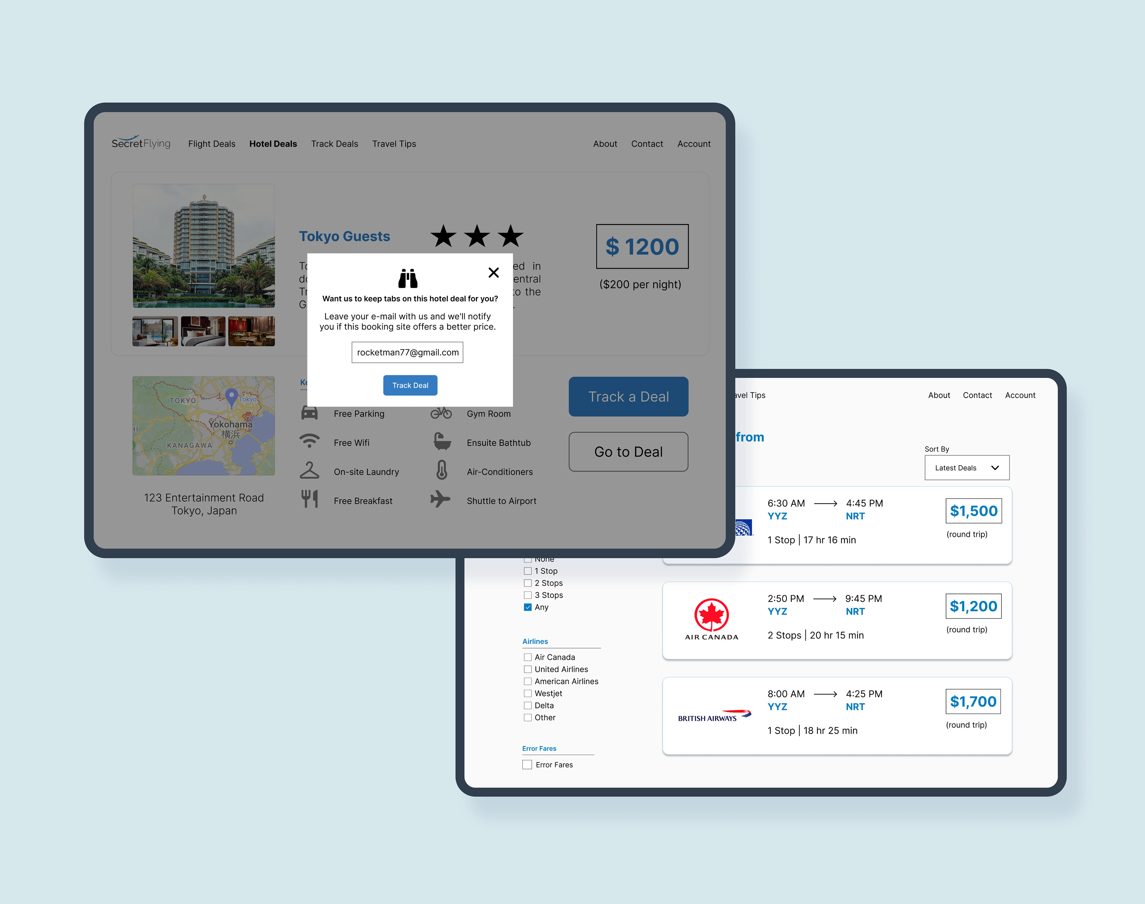
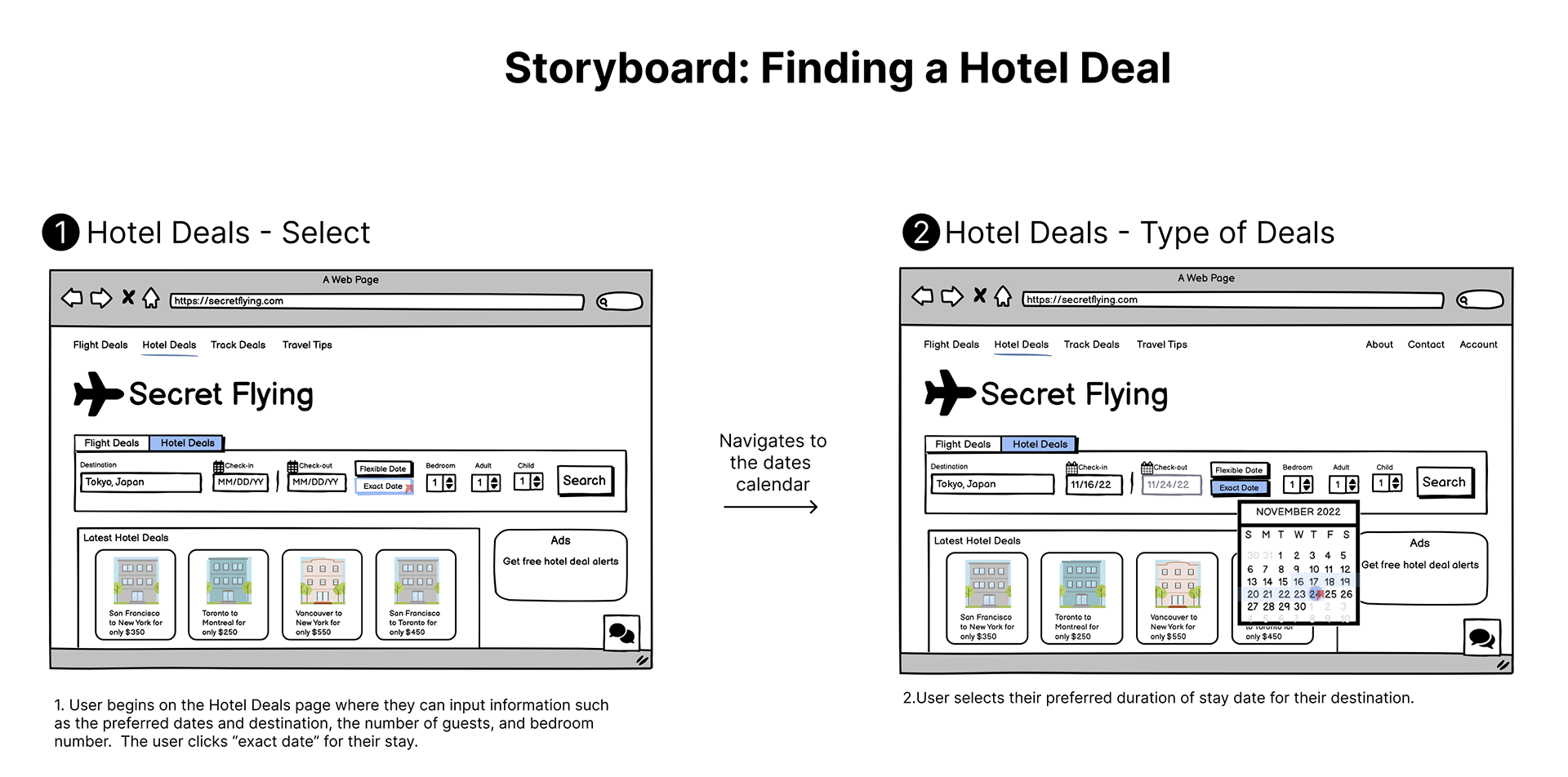
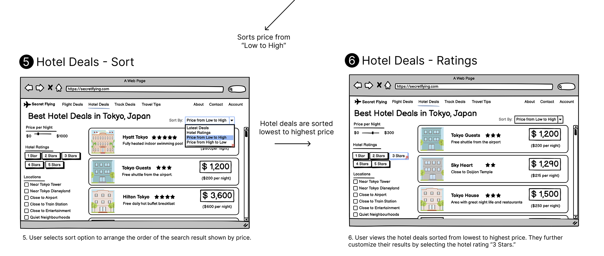
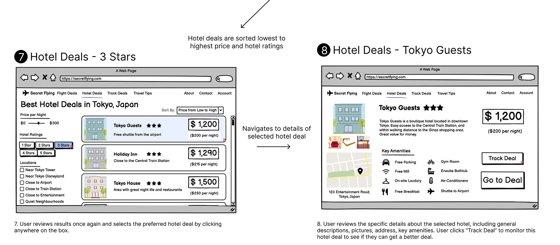
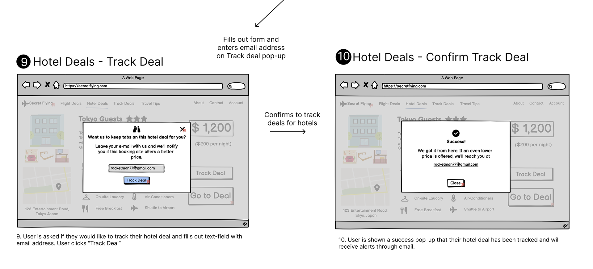
Next, we created a mid-fidelity prototype for SecretFlying which was also presented in a storyboard. Here, the Hotel Deals page is shown.

Final High-Fidelity Prototype
Coming soon...
Next Steps
Conduct more evaluative research
Due to the limited time of the course, it was not possible to do evaluations with any of the prototypes. Thus, I want to conduct more evaluative research, such as heuristic evaluations (to measure usability) and cognitive walkthroughs (to measure learnability), with the high-fidelity prototype to confirm and/or disprove the decisions we made for the redesign of SecretFlying. I believe that there is always room for improvement, so more inspection would help identify any issues we did not consider or failed to improve.
Ensure web accessibility
I want to ensure that the redesign of SecretFlying meets WCAG 2.1 standards so there are no barriers that prevent any user from interacting or accessing the website to find deals for their travel adventures.
Lessons Learned
Lesson #1: You Can't Do Everything
Since we used many research methodologies, it required us to finish each research study and its corresponding analysis before we could move on to another. Specifically, the results of each study built off each other as the project progressed. In the beginning, it was challenging to split parts because everyone wanted to participate in every task to gain experience however, we realized that in order to complete our project efficiently, we had to divide research methods, research analyses and design processes among the six of us.
Lesson #2: Mindful of Words
We realized that we had to be careful and mindful of the words we used in research without misleading or hinting to participants on what they should do. For instance, we executed a pilot test for the tree testing study and noticed that participants chose steps (branches) that had the same words in the task descriptions. Thus, we changed the task description so it has similar words to each step (e.g. discounted flight instead of flight deal). This helped us gain higher direct and indirect success for our tasks.
Thank you for visiting my portfolio!